How to Improve Website Conversion Rates A Practical Playbook
Learn how to improve website conversion rates with proven CRO strategies. This practical playbook guides you through turning visitors into loyal customers.
If you want to get more customers from your website, you have to stop guessing and start measuring. That's the heart of conversion rate optimization (CRO)—a systematic way of turning more of your visitors into paying customers by figuring out what they really want and giving it to them. It's about understanding their behavior, finding the spots where they get stuck, and running smart experiments on things like headlines, buttons, and forms to smooth out their journey.
Building Your Foundation for Higher Conversions
Before you can even think about running an A/B test or tweaking your copy, you need to get your data house in order. Trying to improve conversions without solid analytics is like flying blind. You might be moving, but you have no idea if you're headed in the right direction. This first step is all about getting past fluffy "vanity metrics" like website traffic and zeroing in on the data that shows you what’s actually happening and where the real opportunities are.

The goal here is to set up a system that tells you a story. Where are people coming from? What pages do they visit? And, most importantly, where are they giving up and leaving? Answering these questions is how you start to diagnose why your conversion rate isn't what it should be.
Defining Your Most Important Conversion Goals
First things first: what does a "conversion" actually mean for your business? It's not always about making a sale right then and there. For a SaaS company, a conversion can be any number of small wins that move a prospect closer to becoming a customer. You have to get crystal clear on these micro and macro goals before you can measure anything meaningful.
A few common conversion goals I see with tech startups include:
- Demo Request: This is a high-intent action. Someone is raising their hand and asking for a personalized look at your product.
- Free Trial Signup: A user is willing to give your software a shot, which is a huge indicator of interest.
- Newsletter Subscription: A lower-commitment goal, but it gets a potential lead into your marketing funnel for nurturing.
- Contact Form Submission: A direct line from a potential customer who wants to talk.
You cannot improve what you do not measure. By defining specific conversion goals, you transform abstract website traffic into a clear funnel with measurable drop-off points, instantly highlighting your biggest areas for improvement.
To help you set some realistic expectations, here's a look at different types of conversion goals and what you might see in terms of performance.
Conversion Goal Types and Average Performance
| Conversion Goal Type | Typical SaaS Use Case | Average Conversion Rate | Key Takeaway |
|---|---|---|---|
| Lead Generation Form | Gated content (e.g., ebook, webinar) | 10-15% | Highly specific offers convert well. The more targeted the asset, the better the rate. |
| Free Trial Signup | Core product offering | 2-5% | This is a higher-commitment action. Clarity and a strong value prop are crucial here. |
| Demo Request | High-touch sales process | 1-3% | Lower volume, but these are often your highest-quality leads. Focus on qualifying them. |
| Newsletter Subscription | Blog or homepage opt-in | 1-5% | Highly dependent on the perceived value of your content and the prominence of the CTA. |
These numbers aren't gospel, but they give you a starting point. The average conversion rate across all industries is a pretty sobering 2.9%. But a landing page built specifically for lead capture? That jumps to an average of 11.9%. It just goes to show how much your goals and funnels influence your results.
Setting Up Your Analytics Toolkit
With your goals locked in, it's time to get the right tools in place. You don't need to break the bank on a dozen subscriptions; you just need a couple of solid tools to see both the quantitative and qualitative sides of the story.
- Google Analytics 4 (GA4): This is your command center. It's non-negotiable. Use it to track your goal completions, build out funnels, and slice and dice your user data. For instance, you can set up a funnel report to see exactly how many people make it from your pricing page to a completed trial signup.
- Hotjar (or a similar tool): While GA4 tells you what happened, tools like Hotjar show you why. Heatmaps show you where people are clicking, scroll maps reveal how far they get down your page, and session recordings let you watch anonymized user journeys. Imagine seeing a user repeatedly "rage-clicking" a logo you forgot to link—that's a friction point you'd never spot in GA4 alone.
When you use these tools together, you get a powerful diagnostic system. You might see in GA4 that 70% of users are dropping off on the second step of your signup form. Pop over to Hotjar, watch a few session recordings of that page, and you might discover a confusing form field is tripping everyone up. That combination of "what" and "why" is the engine that drives all effective CRO. Your value proposition is a huge piece of this puzzle, too; if you need a refresher, check out this guide on how to write a value proposition that connects with your audience and gets them to act.
Uncovering Why Your Visitors Are Leaving
Your analytics dashboard is a goldmine for telling you what is happening. It'll show you that 70% of users are bouncing from your pricing page without starting a trial. What it won't tell you is why. This is where the real work begins—moving from cold, hard numbers to the human stories behind them.
To get to the bottom of a leaky conversion funnel, you have to think like a detective. Your job is to find the hidden friction points, the nagging doubts, and the unanswered questions that make someone give up and go elsewhere. You won't find those answers in a spreadsheet. You'll find them by watching and listening.
See Your Website Through Your Customers' Eyes
Honestly, one of the most eye-opening things you can do is just watch people try to use your website. Tools like Hotjar or FullStory let you do exactly that with user session recordings. You get to be a fly on the wall, anonymously watching a visitor’s entire journey—every scroll, click, and hesitant mouse wiggle.
Imagine you see a recording of someone hovering over your "Pro Plan" features. They scroll back up to the main call-to-action, then back down to the feature list, then back up again. That’s not random clicking; that’s a person wrestling with a decision. They're weighing the value, confused about a specific benefit, or just feeling uncertain. That's a conversion opportunity hanging by a thread, and it's an insight you would've completely missed by just looking at a funnel chart.
I've always found that watching just five user session recordings is enough to uncover major usability problems I was totally blind to. The patterns you spot—like people getting stuck on the checkout page or looking confused at the pricing grid—quickly become the foundation for your most impactful A/B tests.
These recordings are also brilliant for catching technical bugs and weird design flaws. You might find a button that doesn't work on a certain mobile browser or a form field that's so frustrating it causes people to "rage click" before leaving. Fixing these issues are often the quickest wins you'll get.
Ask for Feedback at Just the Right Moment
Watching is great, but sometimes the easiest way to find out what's wrong is to just ask. On-page surveys let you jump in at critical moments and get direct, in-the-moment feedback from your visitors. The trick is to be smart about when and what you ask.
Forget about those generic "How was your experience?" pop-ups that everyone ignores. Instead, get targeted with your questions.
- On the Pricing Page: See a user who's been lingering for more than 30 seconds without clicking? A small survey could pop up asking, "Is there anything preventing you from signing up today?" The answers you'll get—"Your pricing is confusing," "I don't see an integration for X," or "I'm not sure which plan is right for me"—are pure gold.
- On Exit-Intent: When someone's mouse is heading for the exit on your signup page, an exit-intent survey is your last chance. Ask, "Before you go, could you tell us what stopped you from creating an account?" You might uncover deal-breaking objections you had no idea existed.
- Post-Conversion: The conversation doesn't end once they've signed up. On your "thank you" page, ask a simple question like, "What was the one thing that almost stopped you from signing up?" This can reveal the final hurdles you need to smooth out for future customers.
When you combine what you see in session recordings with what you hear in surveys, a complete picture starts to form. You stop guessing and start building hypotheses based on actual human behavior. For instance, if recordings show hesitation on the pricing page and surveys mention confusion over plan limits, your next experiment is obvious: redesign the pricing grid for clarity. This is how you find the "why" and start making changes that actually move the needle.
Developing and Prioritizing Your Test Ideas
Alright, so you’ve done the hard work of digging into the "why" behind your user behavior. You're probably sitting on a mountain of session recordings, survey answers, and heatmaps. That's fantastic. But raw data is just that—raw. The real challenge is turning all those observations into a structured plan of attack.
A random list of ideas won't get you very far. What you need is an organized backlog of testable hypotheses. This is where you shift from being a researcher to being a scientist, ready to run experiments that will actually move the needle on your conversions.
Crafting a Powerful Hypothesis
A strong hypothesis is the absolute bedrock of any good CRO program. It’s not just a guess; it's a clear, cause-and-effect statement that comes directly from your research. It’s what connects a change you want to make to a result you expect to see, giving you a clear way to know if you were right.
I've seen the most success using a simple but powerful "If-Then-Because" format:
- If we make a specific change… (e.g., "If we change the CTA button copy from 'Sign Up' to 'Start My Free Trial'...")
- Then we expect a specific outcome… (e.g., "...then we expect to see a 15% increase in trial signups...")
- Because of a specific reason… (e.g., "...because our user research showed people were hesitant, and the new copy clarifies the trial is free, reducing their anxiety about hidden costs.")
This structure is brilliant because it forces you to be disciplined. You have to clearly state the change, the metric you expect to move, and—most importantly—the user-centric reason you believe it will work. This is how you learn from every single test, even the ones that "fail" to produce a lift. If you're looking for more inspiration on the copy side of things, our guide on how to write product descriptions has some great tips that can help strengthen your hypotheses.
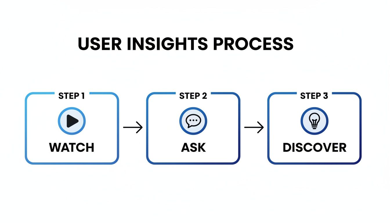
Think of it as a simple, three-part journey: you watch what users do, you ask them why, and then you discover the core insights that will fuel your best test ideas.
This process is what turns vague problems into sharp, actionable hypotheses ready for testing.
Prioritizing Your Tests for Maximum Impact
Once you have a backlog of solid hypotheses, the next question is always the same: "Okay, what do we test first?" For a startup where time and resources are precious, this isn't a trivial question. You can’t test everything at once, so you absolutely need a system to pick the winners.
This is where a good prioritization framework becomes your best friend. One of the most practical and widely used models I've come across is the PIE framework. It helps you score each test idea against three simple criteria:
- Potential: How big of an impact could this change realistically have? Are we talking a minor copy tweak on a thank you page or a complete overhaul of the homepage headline?
- Importance: How valuable is the traffic on this page? A small lift on your high-traffic pricing page is often worth more than a huge lift on an old blog post.
- Ease: How hard is this going to be to actually implement? Is it a 15-minute job for a marketer, or will it tie up a developer and designer for two weeks?
Scoring each hypothesis this way takes the emotion and guesswork out of the equation. The PIE framework forces you to be objective and ensures you’re funneling your limited resources into the experiments that have the best shot at delivering a meaningful return.
To put it into action, you just score each idea from 1 to 10 for each of the three categories. Average the scores, and you've got your final PIE score. The ideas with the highest numbers rise to the top of your roadmap. Simple.
For instance, a simple headline A/B test on your homepage (High Potential, High Importance, High Ease) is going to score much higher than a complex redesign of your entire user onboarding flow (High Potential, High Importance, but very Low Ease). This data-driven approach helps your CRO program build momentum by banking quick, high-impact wins first.
Running Experiments That Deliver Real Insights
You’ve done the research and prioritized your hypotheses. Now for the exciting part—moving from theory to action. This is where you run controlled experiments to see if your brilliant ideas actually move the needle on conversions. A great A/B test doesn't just produce a "winner"; it uncovers a genuine learning about your customers that you can leverage over and over again.

The idea is simple: let real user behavior, not office opinions, decide what works. This disciplined approach takes the guesswork out of website changes and helps build a culture where every tweak is an opportunity to learn.
Choosing Your A/B Testing Toolkit
Good news—you don't need a massive budget to get started. There are fantastic tools out there for every stage, from lean startups to established players. The trick is to find one that plays nicely with your existing analytics stack and is easy for your team to get the hang of.
A few solid choices I've seen work well for SaaS companies are:
- Google Optimize: While it was sunset in late 2023, it was the go-to free entry point for years. Now, its functionality is being integrated into Google Analytics 4, so keep an eye on GA4 for native testing features.
- VWO (Visual Website Optimizer): A really user-friendly platform. Its visual editor is great for non-technical folks who want to set up tests quickly, and it comes bundled with other useful tools like heatmaps.
- Optimizely: This is more of an enterprise-level solution. If you need to run complex, server-side experiments that go beyond simple website copy, Optimizely is incredibly powerful.
Remember, the tool is just the vehicle. The real magic comes from the quality of the experiments you design.
Setting Up a Trustworthy Test
Let’s walk through a classic SaaS scenario. You have a hypothesis: changing your homepage CTA from a generic "Get Started" to a more specific "Start Your 14-Day Free Trial" will drive more signups. The logic is that the new copy is clearer and tackles the user's potential fear of hidden costs.
Here’s how you'd set that up to get a clean result:
- Define Your Goal: Your primary metric is the click-through rate on that CTA button. That's the number you'll be watching.
- Create Your Variation: Using your testing tool, you'll set up "Variation B" with the new "Start Your 14-Day Free Trial" text. Your original "Get Started" version is your "Control," or "Variation A."
- Set Your Traffic Split: You'll almost always use a 50/50 split. This means half your homepage visitors see the control, and the other half sees your new idea. The tool handles all the randomization for you.
This setup is critical because it isolates the one thing you're changing—the button copy. It's the only way to be sure that any change in conversions is due to your tweak and not something else.
Understanding Statistical Significance
This is where a lot of people get tripped up. How can you be sure your results aren't just a fluke? The answer is statistical significance.
You should always aim for a 95% confidence level. In plain English, this means there's only a 5% chance that your results are due to random luck. Calling a test before it hits this threshold is one of the biggest—and most common—mistakes in CRO.
Think of it like a political poll. You wouldn't trust a survey of just 10 people. In the same way, your A/B test needs to run long enough to collect enough data (a large enough sample size) to be confident in the outcome. Most testing platforms calculate this for you and will tell you when a statistically significant winner has emerged.
You have to be patient here. It's incredibly tempting to peek at the results after two days and declare a winner, but don't do it. Daily traffic patterns can easily skew early data. My rule of thumb is to let every test run for at least one full business cycle—usually one to two weeks—to smooth out those fluctuations and get a truly reliable read on user behavior.
Proven Levers for Boosting Website Conversions
Okay, you've done the research and your testing framework is ready to go. Now for the fun part: pulling the levers that actually move the needle. While every site has its own quirks, some optimization tactics are battle-tested and consistently deliver results. Think of these as your go-to plays for making an immediate impact.

This is where all that data gets translated into tangible improvements. We’re moving beyond theory and taking direct action to make your user experience better and guide visitors toward that "yes."
Sharpen Your Copy and Speak to Outcomes
One of the quickest wins in CRO comes from refining your messaging. So many companies fall into the trap of talking about themselves—their features, their tech, their backstory. Here’s a tough-love secret: your customers don’t really care about your product’s features. They care about what those features can do for them.
Your copy needs to act like a mirror, reflecting your customer's biggest problems and then showing them the solution. It’s a simple but powerful shift from talking about "what it is" to "what it does for you."
- Instead of: "Our software has a real-time analytics dashboard."
- Try: "Make smarter decisions, faster, with instant access to your key business metrics."
See the difference? This small change reframes the entire conversation around customer value. When a visitor feels like you get them, they’re far more likely to stick around.
Eliminate Friction from Your Forms
Every single field you add to a form is another hurdle for your user to jump over. Each one is a tiny invitation to just give up and leave. The goal here is ruthless simplicity. Ask only for what is absolutely essential to get them to the next step.
Do you really need to know their company size and phone number just to start a free trial? Probably not. You can always ask for more details later in the onboarding flow, after you’ve already secured the conversion.
I once worked with a SaaS client who cut their signup form from eleven fields down to just three: name, email, and password. The result? A 45% jump in trial signups in the first month alone. Don't let unnecessary data collection kill your conversion momentum.
Making forms easier is a direct line to higher conversions. A shorter form is less intimidating and shows you respect the user's time.
Build Instant Trust with Social Proof
Let’s face it, people are herd animals. We instinctively look to others to validate our choices, especially when money is involved. Social proof is the online version of a trusted friend's recommendation, and it's your best weapon against skepticism.
You can weave social proof throughout your site in a few key ways:
- Customer Testimonials: Short, punchy quotes from happy customers are gold. Place them right next to your calls-to-action to address a specific pain point or highlight a key benefit.
- Case Studies: For bigger decisions, a detailed story showing a customer’s journey from problem to solution is incredibly persuasive.
- Logos of Known Clients: Displaying the logos of companies people recognize is a powerful, instant endorsement.
- Real-Time User Activity: Small pop-ups like "Jane from New York just signed up" create a sense of buzz and urgency.
These elements provide that crucial third-party validation, reassuring potential customers that they’re making a smart choice.
Make Technical Performance a Priority
You could have the most brilliant copy and compelling testimonials in the world, but none of it matters if your website is painfully slow. Site speed isn't just a "nice-to-have" for the tech team; it's a critical conversion factor. When a page lags, people don't wait. They just leave.
Page load speed is one of the most direct and measurable ways to improve conversions. A site that loads in one second can see triple the conversion rates of a site that takes five seconds, and five times the conversions of a ten-second site. With 86% of pages now loading in under five seconds, a fast experience is no longer a bonus—it's the baseline expectation.
For more on this, check out these 10 ways to boost your website's conversion rates and start turning more visitors into customers. Another great tool for instant engagement is live chat; you can explore options in our guide to the best live chat software for websites. Simple things like optimizing your images, using browser caching, and cleaning up your code can shave critical seconds off your load time and directly boost your bottom line.
Your Top CRO Questions, Answered
If you're diving into conversion rate optimization, you've probably got questions. It's a field filled with nuance, and it's easy to get lost. Here are my straight-to-the-point answers to the questions I hear most often from SaaS and startup teams.
What’s a Good SaaS Conversion Rate, Really?
Everyone wants that magic number, but the truth is, a "good" conversion rate is a moving target. The industry whispers about a 2-3% average, but honestly, that number is pretty useless without context. It’s far better to think in terms of specific goals.
For example, getting someone to sign up for a free trial is a relatively low-friction ask. A 2-5% conversion rate there is a solid target. But for a high-commitment demo request? That's a different beast entirely. On a well-tuned page, you could realistically see 5-10% because the traffic is often much more qualified.
The only benchmark that truly matters is your own. If you can take a 1% conversion rate and turn it into 2%, that’s not a small bump—it's a 100% lift in your pipeline. Focus on beating your own numbers week after week. That's how you win.
Ultimately, your goal isn't to hit an arbitrary industry standard; it's to create a system of continuous improvement.
How Long Should I Let an A/B Test Run?
This depends almost entirely on how much traffic your site gets. The golden rule is to run it until you hit statistical significance, which for most of us means a 95% confidence level.
Hitting that number means you're 95% sure the results aren't just a fluke. But there's another piece to this: you have to run the test long enough to capture a full business cycle. For most businesses, that’s at least one to two weeks.
Why? Because user behavior on a Monday morning can be wildly different from a Friday afternoon, especially in B2B SaaS. Running the test for a full week or two smooths out those daily peaks and valleys, giving you a much more reliable picture.
Whatever you do, don't stop the test the second one variation pulls ahead. That's a classic rookie mistake that leads to false positives. Be patient and let the data mature. It’s the only way to get results you can actually trust.
I’m Overwhelmed. Where Do I Even Start Optimizing?
When you’re just starting, the list of potential "fixes" can feel a mile long. The trick is to ignore most of it and focus on where you can get the biggest bang for your buck.
Look for the sweet spot where two factors overlap:
- High Traffic: Pages getting tons of visitors have the biggest audience for your tests. Small wins here can have a huge ripple effect.
- High Business Value: Your homepage, pricing page, and signup flow are mission-critical. Improvements on these pages directly impact your bottom line.
Fire up your analytics and find the biggest "leaks" in your funnel. Where are people dropping off? If you see that 80% of visitors hit your pricing page and then vanish without a trace, you've just found your starting point. That’s not just a data point; it's a giant, flashing neon sign telling you exactly where to focus your energy first.
Can I Actually Improve Conversions Without A/B Testing?
Absolutely. While A/B testing is the most scientific way to validate your ideas, you can make huge strides by simply implementing proven best practices. You don't always need a test to tell you what's likely to work.
Think of it as deploying common-sense fixes based on heuristic analysis (an expert gut-check) and what your users are already telling you. For instance:
- Make Your Site Faster: A slow website kills conversions. Period.
- Nail Your Value Prop: Is it crystal clear what you do and for whom within three seconds of landing on your page?
- Add Social Proof: Testimonials, case studies, and logos from happy customers build instant credibility.
- Simplify Your Forms: Every extra field you ask for is another reason for someone to give up. Cut the fat.
These are low-hanging fruit that can move the needle right away. Just remember, without a test, you won't know for sure which change made the difference or precisely how big the impact was. But when you're starting out, progress is more important than perfection.
Ready to get your SaaS in front of thousands of early adopters and tech enthusiasts? With SubmitMySaas, you can launch your product to a targeted audience and gain the initial traction you need. Submit your SaaS today!